Investment Risk vs Savings Risk
I have seen this question posed a lot within the FIRE communities, and typically it goes along the lines of:
“I am saving to buy a house, am I better off investment my money while I save, or just keep it in the bank?”
The answers seem to typically relate back to personal risk tolerance and some people would be fine for short term investing (around a year) or some prefer to go for longer term (around 5 years) before they can justify investing compared to just saving.
I thought I would have a look at the past to determine what scenario would work best given historical data of the SPY ETF.
Before I started this process, I was typically of the thought process that around 3 years would be the cut-off point before I invested the money instead of just saving it. Anything less than 3 years I would save in the bank, and anything longer I would prefer to invest. I should mention that I also believe it depends a lot on how flexible you might be with your future financial requirements, if you had to withdraw the money by a specific time, then you might adopt a lower risk approach and use the bank. However, if you could be flexible and could hold the money in your investments for a period of time to wait out a downturn, then you could adopt a higher risk approach.
This post will assume there is no flexibility in the withdraw period, and the investment is withdrawn immediately, regardless of there being a downturn in the market or not.
Methodology
I use SPY ETF because it has been around since early 1993 so it has a useful amount of historical data attached to it.
Using the historical share price data, I will simulate investing each month for a certain time period and compare this to a base case scenario. The time periods I will simulate the investing are as follows:
- 1 Year
- 2 Years
- 3 Years
- 4 Years
- 5 Years
Example:
1st simulation for 1 year will involve investing $5,000 at the start of each month between 1/2/1993 and 1/1/1994.
2nd simulation for 1 year will involve investing $5,000 at the start of each month between 1/3/1993 and 1/2/1994.
This will continue for the duration up until the most recent historical data.
These simulations will be compared to the base model, of set return of 3.00% per annum, compounding monthly. This is to simulate just putting the money into a bank or offset account.
Number of Simulations
Each time period will have the following number of simulations created as part of the modelling:
- 1 Year – 333 Simulations
- 2 Years – 321 Simulations
- 3 Years – 309 Simulations
- 4 Years – 297 Simulations
- 5 Years – 285 Simulations
Overall, there will be 1,545 Simulations created.
Results
The Base for comparison will be as per the following for each time-period that is simulated:
- 1 Year – $60,989.99
- 2 Years – $123,822.87
- 3 Years – $188,573.06
- 4 Years – $255,292.68
- 5 Years – $324,041.65
I have not included any capital gains calculations in either the base model or the simulations, although it would be applicable and might affect the overall return received, it would not affect if the simulation was a better return compared to the base scenario.
I have also included a brokerage of $10.00 per month in the simulation scenarios.
The first table shows the breakdown of simulations which outperformed or underperformed in comparison to the Base Model
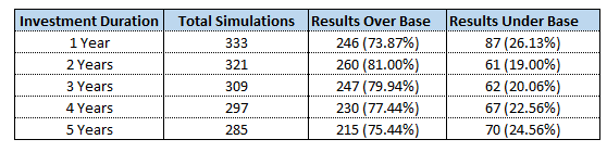
One of the things that I found most interesting, was that it was not too determinate based on the time period, the percentage of results that outperformed the base scenario was still relatively the same. All 5 time periods showed investing would have outperformed saving around 73 – 81% of the time.
Immediately, it shows that in the vast majority of cases you will end up better off if you invest your money, even under a shorter time period, compared to just saving it and collecting a guaranteed but lower return.
There is one thing that these results do not tell me however, the scale at which each simulation outperformed or underperformed the base scenario. For example, if I outperform the base scenario by 10% over 80% of the time, then it might look great, but if in those 20% of simulations where I underperform it is by over 50%, then it could show interesting results.
Results – Breakdown of Performance
The following table will breakdown the number of simulations that fall into the following 7 categories:
- Simulation underperformed base model by worse than -40%
- Simulation underperformed base model by between -20% and -40%
- Simulation underperformed base model by between 0% and -20%
- Simulation outperformed base model by between 0% and 20%
- Simulation outperformed base model by between 20% and 40%
- Simulation outperformed base model by between 40% and 60%
- Simulation outperformed base model by more than 60%
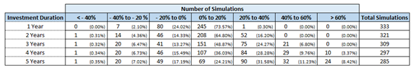
This is starting to tell more of a picture anyway. As you can see, the vast majority of simulations for the 1-year time period end up between -20% and +20% of the base scenario. This makes sense because there is not enough time for the share market to be volatile enough to provide returns outside these parameters with increasing consistency.
The longer periods, however, are quite interesting. The number of simulations which return less than 20% for time periods between 2 and 5 years, so not change significantly. Whereas the number of simulations with the higher returns (greater than 40%) seems to increase significantly the longer the time period seems to be.
While you have roughly the same chance of obtaining a positive return, regardless of the time period, the chances of obtaining a higher return increase considerably the longer you are able to hold your investment for. Given the higher chance of providing a larger return, this would make it a lower risk option compared to investing over shorter time periods.
Next, I will look at the average final returns based on the simulations.
Results – Average Return by Time Period
Below is a table which shows the average final return of each time-period:
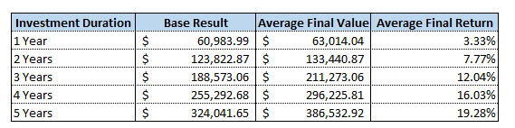
The Average Final Return in the last column is relative return to the base result.
As the table shows, it aligns with the previous point where the longer duration coincides with a greater return on average.
Even though there is typically a better return with a shorter duration, the additional return (3.33% for 1 Year) may not be enough to justify the additional risk. This would explain another reason why people tend to save money instead of investing for the shorter-term durations.
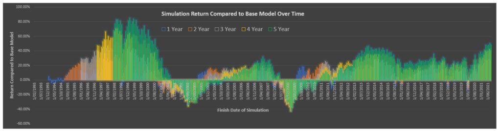
Results – Location of Negative Returns
Finally, I want to have a look at which dates coincide with negative returns, to see if we are able to point out what brought on the negative results.
Without looking at the results, one could assume they would align with big downturns or crashes in the market occurring at the time the investments were withdrawn. The graphs below show the return of each time period marked on the completion date of the investment period (i.e., the day the money is withdrawn from the investment).
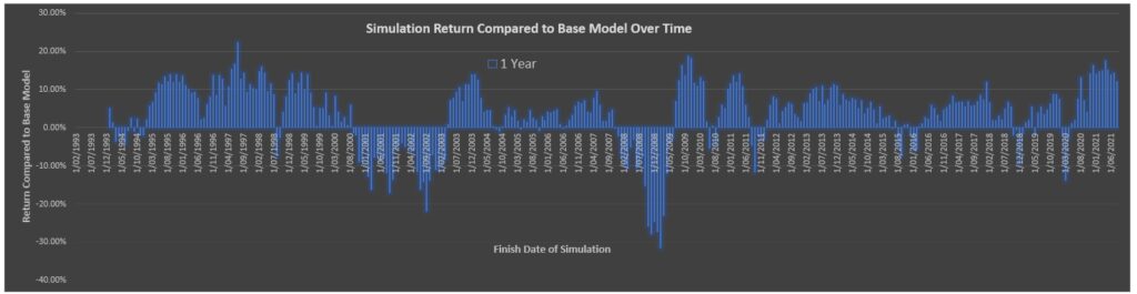
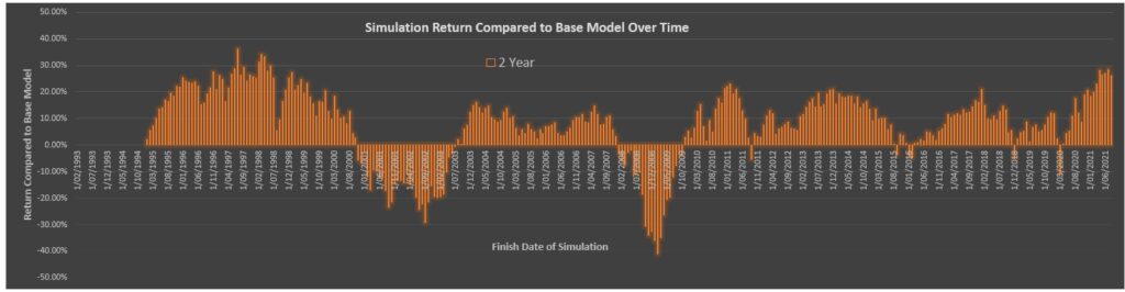
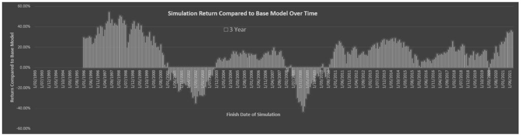
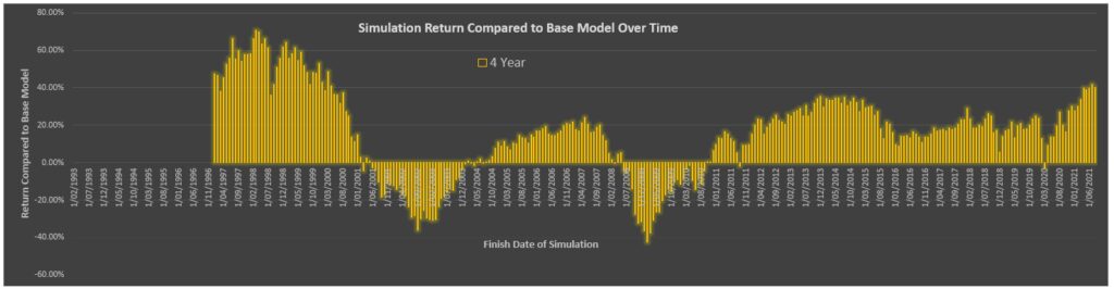
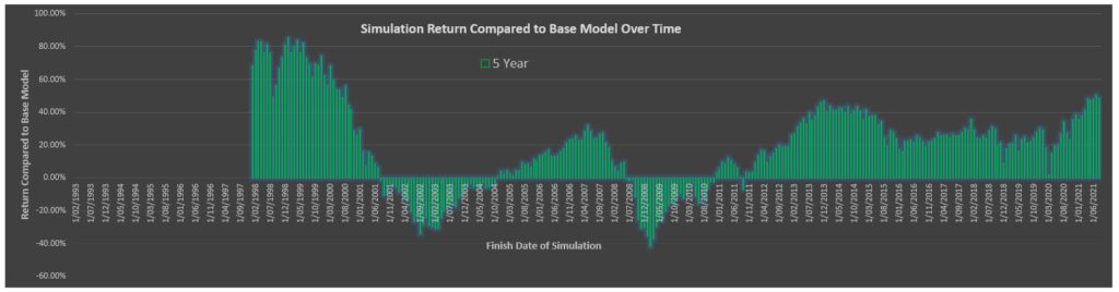
As was expected, there are some defined periods of negative returns, particularly for the longer-term time periods.
The 5 Year Time Period only has 3 clusters of negative returns:
- Between mid-2001 and late 2004 (around the time the dot com bubble bust)
- Between mid-2008 to late 2010 (around the time of the global financial crisis)
- One point in mid-2011 (I am not sure what this coincides with to be honest)
Even the recent Covid Crash still provided a positive return on the worst time period of March 2020.
As each time period becomes shorter and shorter, there are more and more clusters of negative returns, with the 1 Year Time Period having several spikes of negative returns sporadically throughout the simulation.
It is not inherently obvious on the graphs shown above, but the magnitude of the return changes significantly, increasing as the time period increases up to 5 years.
The below graph has all the graphs overlaid so you can see the magnitude changes.
The most interesting thing I found from the above chart is that while quite often the positive returns do increase in magnitude with the longer time periods, the negative returns actually seem to stay at relatively the same level among the 3,4- and 5-year time periods.
The above aligns with the table produced before which shows the number of results <20% compared to the base model does not increase among these same time periods. While at the same time, the number of >20% positive returns have significantly increased, as was shown in the table and also in the above graph.
Conclusion
I am really glad I spent the time to go through these numbers. While the results were not particularly surprising, it was nice to have some sort of evidence to back up what is generally the consensus within the FIRE community.
As I said at the beginning of this post, I suggested that my cut-off point to split between investing or saving was 3 years, and it looks like the numbers seem to back up that logic. Although even at a 1-year timeframe, it does show that the average return is 3.33% higher than putting the money in the bank, given there is still a 25% chance of having a negative result, it does not look to really be worth it.
Although at longer time periods, there may still be around 25% chance of a negative result, the average return is 12% higher (for 3 years) and there is also a 30% chance of having a return greater than 20% higher than the base case.
In the end it is all about risk and what sort of risk you are willing to accept to obtain that return. For people who are particularly risk averse, there is every chance that even for a 5 year time frame they would still prefer to put their money in the bank, as they just would not want to have a 25% chance that they receive a lower return, and that is completely understandable.